Tonight I don't have any pictures to post because I'm animating on my laptop and the whole process gets messy. Instead, I figured I would share some links that may be generally useful for me and everyone else. It's still research/thesis related, there just isn't anything to look at.
So you wanna learn Photoshop? You should try this ridiculous list of tutorials here.
And say you need some anatomy help. Well, this is an equally ridiculous list of Deviantart tutorials on anatomy and drawing people.
Perhaps animals are giving you some issues? Behold, the answers may be in this list somewhere.
Each link is to a Deviantart page that links to almost every tutorial on DA for that particular subject. I haven't been through the animal one, but I've probably been through most of the Photoshop tutorials just by searching around on DA without this list. (And now I find it, great.) I've looked through a lot of the anatomy links before. My favorites are anything by Cedarseed like the one for faces, different ethnicities and regional variations in human anatomy, general genetic variation in humans, and the general guide to musculature. The drawings are very simple and everything's explained pretty well. (Weirdly enough, I'm almost dead on with the Baltic body type given my Eastern-European genes, and I draw most of the time in a style that resembles those face shapes too.) The detail of information is incredible and really fascinating.
I know not everyone learns very well through reading and books and such, but learning this way is literally how I learned to draw. I've been reading books on drawing since I was in elementary school, and even if I may lose a bit by not reading everything that goes with the pictures, I always come out of a book with a few more skills than I started with.
So, there's my research. I've been looking at tutorials on DA to learn to draw stuff and color it. In actual animation news, I'm almost finished with this scene where Ella sits down and looks disgruntled and it really makes me happy. I can see so much improvement in the flow and proportions of my animation even from last semester and it makes me happy. I'm glad I'm keeping my lines loose for cleanup because it really preserves my drawing style better.
senior thesis blog funtime.
Saturday, March 15, 2008
Saturday, March 8, 2008
This is probably what it sounds like when doves cry.
I had this great combination of determination, exhaustion, and anxiety last night that somehow convinced me that most of my issues with this film could be solved by cutting out two scenes and adding like...14 or something. I realized that a lot of my animation issues were stemming from trying to do too many actions in one shot instead of cutting, and it only made me reluctant to even bother animating. INSTEAD, I've done up a few things to increase clarity as well as increase the amount of cuts I'm doing per scene.
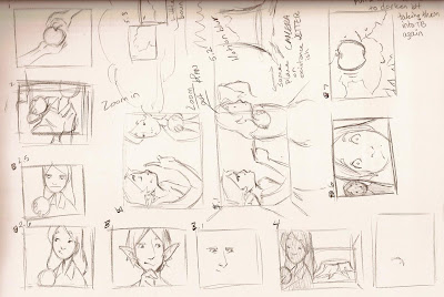 This is the first part of where Mel gives her the apple to appease her and it doesn't work. She takes it from him, sits down as the camera zooms in a bit, then she looks unamused. He gets on his thinking face and sees the stump behind her. Then it cuts to the part in the middle of the page (hey, I understand it, you don't have to) where he points behind her and she sees the tree shoot up. Then she gets all shocked face, and it cuts to an apple wigglin' in a tree.
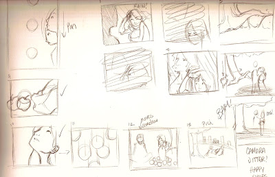 Contine to the apple falling (motion blur!) as the screen pans down with her looking at it. Then it lands next to her. She looks up at the tree (I need to switch screen direction on all three of those), a whole bunch of apples fall (After Effects!), and then they sit next to each other and he looks pleased. Then she pushes him.
I think as long as I establish that the tree grows to the point that it sort of looms over them, it should be okay. Right now, it sort of seems too far away.
The other stuff is the redo for the last set of the scenes where she visits him during the seasons. I'm not going to explain that part. I have to animate it next week, anyway.
AND, I know this is a lot of work, but it needs to be done. My film's not coming together like it should and I should've done this a long time ago. I'm technically ahead on my animation anyway. Three of these shots are animated (one I need to fix up a lot, though), and one of them is an adjustment to an earlier scene. I have to do the tree growing scene today and a few of the reaction shots I think.
Look at my progress! I need to darken the lines still, but I might have to batch my PSD files in Photoshop first and bring them into ToonBoom again over my colored layer. ToonBoom doesn't want to darken them any further because they're so light to begin with. The timing's a little off, but I'll probably have to cut off a bit at the beginning anyway when I cut it together. The background doesn't really have buildings yet. I still have to do those :).
 This is the first part of where Mel gives her the apple to appease her and it doesn't work. She takes it from him, sits down as the camera zooms in a bit, then she looks unamused. He gets on his thinking face and sees the stump behind her. Then it cuts to the part in the middle of the page (hey, I understand it, you don't have to) where he points behind her and she sees the tree shoot up. Then she gets all shocked face, and it cuts to an apple wigglin' in a tree.
 Contine to the apple falling (motion blur!) as the screen pans down with her looking at it. Then it lands next to her. She looks up at the tree (I need to switch screen direction on all three of those), a whole bunch of apples fall (After Effects!), and then they sit next to each other and he looks pleased. Then she pushes him.
I think as long as I establish that the tree grows to the point that it sort of looms over them, it should be okay. Right now, it sort of seems too far away.
The other stuff is the redo for the last set of the scenes where she visits him during the seasons. I'm not going to explain that part. I have to animate it next week, anyway.
AND, I know this is a lot of work, but it needs to be done. My film's not coming together like it should and I should've done this a long time ago. I'm technically ahead on my animation anyway. Three of these shots are animated (one I need to fix up a lot, though), and one of them is an adjustment to an earlier scene. I have to do the tree growing scene today and a few of the reaction shots I think.
Look at my progress! I need to darken the lines still, but I might have to batch my PSD files in Photoshop first and bring them into ToonBoom again over my colored layer. ToonBoom doesn't want to darken them any further because they're so light to begin with. The timing's a little off, but I'll probably have to cut off a bit at the beginning anyway when I cut it together. The background doesn't really have buildings yet. I still have to do those :).
Wednesday, March 5, 2008
Have a background.
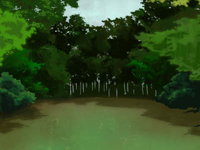
Here at my internship, the connection's too slow to update with video, but I'll try and put up my test from Toonboom soon. It turned out well considering I did a scene that only had an eye blink. I would upload the background I did for that scene too, but I left it at home.
This is the background for the very last scene of the film. It's actually a very modified version of the background for a scene not too far before it, but I don't think they're similar enough for anyone to notice. This took me maybe an hour to do, but I could do it faster if I had to, I think. At this point, I've almost got the forest from every angle, so I'm just copying and pasting bits of trees into other scenes. I really like the look so far :).
My next post will have the colored scene in it, I promise!
Monday, February 11, 2008
I'm posting again!
This is four seconds of non-stop thrill ride animation. Or something. I worked on this most of the weekend, and while Mel still doesn't move a muscle, at least Ella's movement is fairly fluid. Forgive my lazy apple-falling action, because it just wasn't meant to happen in Mirage this weekend. I plan on making some apples and having them fall like crazy in After Effects. The idea is that one or two fall, so she looks up, then a whole slew of them fall down from the tree and she is surprised. Yay!
Also, because I'm feeling generous, have a background! I crosshatched this using a fantastic brush from Photoshop in the lab. I know it's a bit much. I'm very aware of it. But at this point, I also realize that most of my artwork is going to get blown out like crazy when projected unless I overdo it a little bit. Plus, I like crosshatching :D.
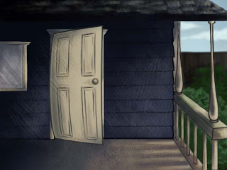
Also, because I'm feeling generous, have a background! I crosshatched this using a fantastic brush from Photoshop in the lab. I know it's a bit much. I'm very aware of it. But at this point, I also realize that most of my artwork is going to get blown out like crazy when projected unless I overdo it a little bit. Plus, I like crosshatching :D.

Sunday, January 20, 2008
Time to update!
I would update with something amazing showing how much progress I have done, but that's all at home on my PC and I'm currently at work. Instead, I'll talk about what else I've been doing to research for this film.
For the last few days I've been overdosing on high budget, larger scale anime movies. Satoshi Kon is one of my favorite directors, and he's done some really awesome work on films like Perfect Blue, Millennium Actress, and Paprika. Most of them make no sense, but the visuals are amazing.
So today was Millenium Actress: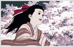
I can't find much online to really do the visuals justice, but the movie's really amazing as far as the wonderful muted color palettes that it uses and all the patterns in the clothing.
Last night, I watched Metropolis with Lauren. It's roughly based on the original B&W version, but it's a really wonderful reimagining based on the work of Osamu Tezuka. I remember seeing this movie in a small theater in Chicago with my dad when it came out in 2001, so I'm still really fond of it. It was hard to find images online that really capture the amazing visuals of this movie, but every shot is an awesome study in color. I really am relying on this film's palette for my own movie. Sure, it won't look anything like Metropolis, but the way the colors are so saturated but also very grungy really appeals to me.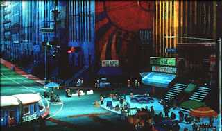
Other than that, I've been spending my time at work today looking for resources for finishing my film on Deviantart. Right now, my favorite resource is this person's stock portfolio. They have some really great textures that I'm going to use on all the trees in my film, as well as some great brushes to give things some nice texture. I don't want anything to look too flat, so the more brushes I can use to make things more appealing the better :).
Today and yesterday I've been working on trees. I'll try and post some progress when I've really made some. I first attempted to make them move using the Warp Grid tool in Mirage after a few aborted attempts in Photoshop, but the warp grid was too much. It looked like a tornado had swept through and sort of turned the trees into over-reacting jelly. Now I'm working on a really subtle cycle so they move a little in the background. This is really for only one shot, but I don't want the trees to stand out too much from the rest of the movie. I'm probably going to have to mess with the colors and go over everything with some brushes and texture in photoshop to make it blend in better.
Okay! I'll post something to see later on.
For the last few days I've been overdosing on high budget, larger scale anime movies. Satoshi Kon is one of my favorite directors, and he's done some really awesome work on films like Perfect Blue, Millennium Actress, and Paprika. Most of them make no sense, but the visuals are amazing.
So today was Millenium Actress:

I can't find much online to really do the visuals justice, but the movie's really amazing as far as the wonderful muted color palettes that it uses and all the patterns in the clothing.
Last night, I watched Metropolis with Lauren. It's roughly based on the original B&W version, but it's a really wonderful reimagining based on the work of Osamu Tezuka. I remember seeing this movie in a small theater in Chicago with my dad when it came out in 2001, so I'm still really fond of it. It was hard to find images online that really capture the amazing visuals of this movie, but every shot is an awesome study in color. I really am relying on this film's palette for my own movie. Sure, it won't look anything like Metropolis, but the way the colors are so saturated but also very grungy really appeals to me.

Other than that, I've been spending my time at work today looking for resources for finishing my film on Deviantart. Right now, my favorite resource is this person's stock portfolio. They have some really great textures that I'm going to use on all the trees in my film, as well as some great brushes to give things some nice texture. I don't want anything to look too flat, so the more brushes I can use to make things more appealing the better :).
Today and yesterday I've been working on trees. I'll try and post some progress when I've really made some. I first attempted to make them move using the Warp Grid tool in Mirage after a few aborted attempts in Photoshop, but the warp grid was too much. It looked like a tornado had swept through and sort of turned the trees into over-reacting jelly. Now I'm working on a really subtle cycle so they move a little in the background. This is really for only one shot, but I don't want the trees to stand out too much from the rest of the movie. I'm probably going to have to mess with the colors and go over everything with some brushes and texture in photoshop to make it blend in better.
Okay! I'll post something to see later on.
Sunday, December 2, 2007
Well, I haven't posted in awhile, but considering how huge my current animatic is, I figured I would upload my roughs for a shot later in the film. I spent this afternoon trying to find a good source online about hair blowing in the wind and couldn't find anything. I found a lot of 3D animation videos of "hair" reacting to "wind," and the effect was almost right. In the end I went with my gut and I think it turned out pretty well. I worry for the day that I will need to ink and color this, because that will be a sad day. At least their bodies don't move. Also, since this is just straight out of Mirage, when she disappears off the screen, assume that there'll be more of a transition than this. There'll be some dissolving action. Right now she just sort of BAM, isn't there anymore.
Also, in super fantastic news, my webpage is back up again! Yay for me! I've had a webpage since...middle school? When I entered college it kind of went to hell and I didn't have time to update anymore. This time around I made it in the interest of having a portfolio website available when I need one. I coded everything by hand, and I'm almost sold on really liking it. Next time around I may go for something with slightly less of a boxy look. It's hosted on my friend Kyle's webspace and it's named Cheshire because my webpage has always been called that.
Check out my personal webpage, everybody!
I'm sure I have more fun news, but I'll post about it later.
Monday, November 5, 2007
The quick brown fox jumped over the lazy rabid badger.
Blogger decided to have a freak out on me and wouldn't let me type anything. I appreciate that in a blogging website, really.
Today I did some animation and worked on finalizing the look of a few shots. I will present them to you now! (Go team!)
This first image is a shading test I did. This was colored in Mirage using the closest colors I can decide on for my final look. They keep changing, so just assume that in another month her skin will be green, her hair will be red, and she'll be wearing purple slacks and a tshirt. For now, though, I'm liking the slightly more blue-green dress (as apposed to the more washed out blue-gray color), and her hair is a dark yellow with light orange shading. Her skin color seems pretty bland right now, but maybe I'll figure that out eventually. My ultimate goal is to be able to get enough animation done this semester that I can use shading in my film. I haven't tried it in any other animation I've done yet, and I think it could really be successful.

This next image is the scene I did for class on Tuesday. I only colored this one frame, but the look is really pretty awesome. I spent the afternoon looking through Deviantart for inspiration on my trees, and I'm pretty darn happy with this outcome, honestly. I'm not sure how this blue-green color is going to carry over from previous scenes (there's a shot of just the trees/bushes a few shots earlier than this), but I really think it has a better atmosphere than using green. It's hard to tell, but Mel is a very dark brown, not black. (Hopefully that will read on other computers, as my screen is probably very bright.) I colored this in Photoshop, then duplicated each layer and blurred the copied layers behind the original layers. As there's very little actual animation in this scene, I wanted to make it look impressive. I'm planning on using After Effects to move the different layers to give it a very ominous feeling :).

Also, in my Devianart explorations today I came across a fun tutorial on Photoshopping trees. I didn't end up using it in this picture, but with this many trees to draw, I assure you it will come in handy in the future.
Haha! Now my goal is to try and customize this blog to some extent. I already changed the background, but my goal is to change the rest of it by the end of the year :). I can't have my seldom-used HTML and CSS skills go to waste.
Today I did some animation and worked on finalizing the look of a few shots. I will present them to you now! (Go team!)
This first image is a shading test I did. This was colored in Mirage using the closest colors I can decide on for my final look. They keep changing, so just assume that in another month her skin will be green, her hair will be red, and she'll be wearing purple slacks and a tshirt. For now, though, I'm liking the slightly more blue-green dress (as apposed to the more washed out blue-gray color), and her hair is a dark yellow with light orange shading. Her skin color seems pretty bland right now, but maybe I'll figure that out eventually. My ultimate goal is to be able to get enough animation done this semester that I can use shading in my film. I haven't tried it in any other animation I've done yet, and I think it could really be successful.
This next image is the scene I did for class on Tuesday. I only colored this one frame, but the look is really pretty awesome. I spent the afternoon looking through Deviantart for inspiration on my trees, and I'm pretty darn happy with this outcome, honestly. I'm not sure how this blue-green color is going to carry over from previous scenes (there's a shot of just the trees/bushes a few shots earlier than this), but I really think it has a better atmosphere than using green. It's hard to tell, but Mel is a very dark brown, not black. (Hopefully that will read on other computers, as my screen is probably very bright.) I colored this in Photoshop, then duplicated each layer and blurred the copied layers behind the original layers. As there's very little actual animation in this scene, I wanted to make it look impressive. I'm planning on using After Effects to move the different layers to give it a very ominous feeling :).
Also, in my Devianart explorations today I came across a fun tutorial on Photoshopping trees. I didn't end up using it in this picture, but with this many trees to draw, I assure you it will come in handy in the future.
Haha! Now my goal is to try and customize this blog to some extent. I already changed the background, but my goal is to change the rest of it by the end of the year :). I can't have my seldom-used HTML and CSS skills go to waste.
Subscribe to:
Posts (Atom)